Stock charts are invaluable tools for traders and investors, offering a visual representation of price trends, volumes, and historical performance. Whether you are analyzing equities for long-term investing or short-term trading, understanding the strengths and limitations of different types of stock charts can improve your decision-making process.
Different charts display price data in various ways, making them suitable for specific needs. For example, candlestick charts often provide detailed visual insights for short-term analysis, while line charts are preferred for identifying long-term trends. Investors tracking stocks like the IDS share price rely on these tools to interpret price behavior and analyze market movements.
Understanding Stock Charts: Why They Matter

Stock charts are visual tools that display how an asset’s price moves over a specific period. By presenting data graphically, charts help investors and traders identify trends, price ranges, and historical performance. This ability to “see” patterns simplifies complex price data and makes analysis more intuitive.
Stock charts play a critical role in technical analysis, which relies on price patterns and trading volumes to identify market behavior. For instance, an upward-sloping price line may suggest a bullish trend, while erratic price swings might indicate high volatility. Traders can also incorporate additional tools like moving averages, volume indicators, and Bollinger Bands to extract deeper insights from charts.
However, it’s important to remember that charts display historical data. They are not predictive tools. Interpreting charts effectively requires recognizing their benefits, such as pattern identification, while understanding their limitations—markets are unpredictable and influenced by external factors.
By using charts wisely, investors gain a better understanding of market behavior, helping them analyze past trends and price movements.
Types of Stock Charts and Their Benefits
Line Charts: Simplicity for Trend Analysis
A line chart is the most straightforward stock chart, connecting closing prices with a single line over a specified period. This clean and minimalist design makes it easy to identify the overall direction of a stock’s price movement.
Line charts are widely used to track long-term trends because they eliminate short-term fluctuations, or “noise,” that can obscure the bigger picture. For example, a steadily rising line indicates a positive trend, while a declining line shows a bearish direction.
These charts are ideal for long-term investors who are focused on overall growth rather than day-to-day price movements. However, line charts provide limited detail, as they only display closing prices. Information about intraday highs, lows, and opening prices is not shown.
Despite their simplicity, line charts are effective for identifying trends and understanding the long-term performance of an equity.
Bar Charts: Detailed Insights into Price Movements
A bar chart provides more detail compared to a line chart. Each bar represents a specific time frame—such as one day or one hour—and shows four key data points:
- Open price: Where the price started.
- Close price: Where the price ended.
- High price: The highest point during the period.
- Low price: The lowest point during the period.
The structure of a bar allows traders to analyze price behavior and volatility within each period. For example, a long bar suggests significant price swings, indicating high volatility. Conversely, shorter bars reflect price stability.
Bar charts are often used to identify support and resistance levels. Support occurs when prices stop falling and bounce upward, while resistance happens when prices fail to rise beyond a certain level. These levels help traders evaluate price movements and market trends.
While bar charts provide detailed insights, their visual complexity can be challenging for beginners. For medium-term traders who need more information than a line chart offers, bar charts strike a good balance between detail and usability.
Candlestick Charts: The Preferred Tool for Active Traders
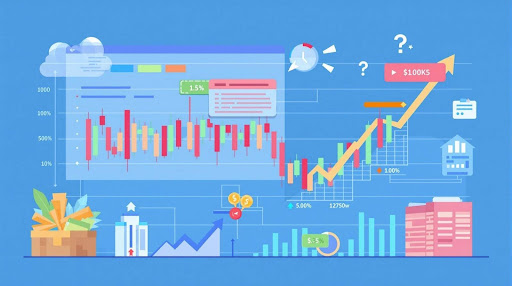
Candlestick charts are highly favored for their ability to combine detailed price information with an intuitive visual format. Each candlestick represents a specific time frame and displays four key data points: the open, close, high, and low prices. The “body” of the candle indicates the range between the open and close, while the “wicks” (or shadows) show the high and low.
What sets candlestick charts apart is their ability to highlight patterns that may indicate reversals or continuations. For example:
- Doji candles: Suggest indecision in the market.
- Hammer candles: Can signal a bullish reversal after a downtrend.
- Engulfing patterns: Indicate a potential trend reversal when one candle “engulfs” the previous one.
Candlestick charts are particularly useful for short-term traders who need precision and timing. They allow traders to observe price movements in greater detail and spot opportunities based on recognizable patterns.
However, interpreting candlestick charts requires experience. Without proper knowledge of patterns, there’s a risk of misreading signals. Despite this, candlestick charts remain one of the most versatile tools for traders seeking to analyze short-term market movements effectively.
Key Features to Look for in a Stock Chart Platform

Real-Time vs. Delayed Data
The availability of real-time data versus delayed data is a key consideration when choosing a stock chart platform. For day traders and active investors, real-time data is critical. It allows them to respond to price movements and breaking news instantly.
On the other hand, long-term investors who analyze quarterly or yearly trends may find delayed data sufficient for their needs. Many free chart platforms provide delayed data, which often updates every 15 minutes, whereas paid platforms offer real-time updates.
Ultimately, the choice depends on the investor’s strategy and time frame. Real-time data ensures precision for those trading intraday, while delayed data can still provide valuable insights for broader trend analysis.
Technical Indicators and Overlays
Technical indicators and overlays enhance stock charts by providing tools for deeper analysis. Some of the most widely used indicators include:
- Moving Averages: Help smooth out price fluctuations to identify trends.
- Relative Strength Index (RSI): Highlights whether a stock is overbought or oversold.
- Bollinger Bands: Indicate levels of volatility and potential price reversals.
A good charting platform allows users to layer multiple indicators on a single chart for customized analysis. For example, traders might combine moving averages with RSI to validate a trend.
It’s important to choose tools that align with your trading strategy. Short-term traders may focus on momentum indicators, while long-term investors might use moving averages to confirm trends.
Free vs. Paid Stock Charts: Pros and Cons
Free stock charts offer basic tools and are ideal for beginners. They provide essential indicators and delayed data, which can be sufficient for analyzing general trends. However, free platforms often lack advanced features like real-time updates and customization options.
Paid stock charts cater to active traders who need precision and advanced tools. They offer real-time data, advanced technical indicators, and the ability to save custom layouts.
How to Choose the Best Chart for Your Trading Style
Different trading styles require different chart types. Long-term investors may prefer line charts for their simplicity, while short-term traders often rely on candlestick charts for detailed analysis.
Avoiding Common Mistakes When Using Stock Charts
While stock charts are useful tools, over-reliance can lead to mistakes. It’s important to combine technical analysis with other methods, like fundamental analysis, to make informed decisions.
Conclusion: Picking the Right Stock Chart to Suit Your Needs
Choosing the right stock chart depends on your trading goals. Whether you focus on trends, detailed price movements, or patterns, understanding how to use line, bar, and candlestick charts effectively can improve your market analysis.
By combining stock charts with reliable data and sound analysis, investors and traders can gain deeper insights into market behavior and make informed decisions.


 usdt
usdt bnb
bnb

